
The banking industry is changing and the competition surrounding technological advances seems to be increasing now more than ever. Included in this shift is a strong acknowledgement of a user’s experience or “UX” on the web. People expect more from their banks. It’s becoming the norm for individuals to be able to complete all of their financial needs right from their computers and/or smartphones without ever having to step foot inside a bank.
Are banks the next Blockbuster and Netflix?
Many businesses are steadily becoming solely online providers from a client’s perspective, with brick-and-mortar only serving internal operations. For instance, consider Blockbuster, or the taxi system. These both gave way to online competitors like Netflix and Uber. The good news, is the banking industry can evolve from “blockbuster” or “taxi” to “Netflix” and “Uber.” But a good user experience (UX) is a requirement for a successful evolution.
So what is UX?
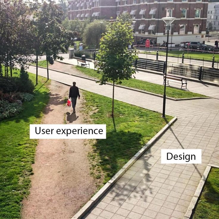
UX is essentially the ability to provide delight to your user. It’s as simple as that, but we so often overlook this requirement. We’ve all been to a site and not been able to readily find what we’re looking for, had annoying pop-ups or “interstitials” cover our screens, or had content return error messages. These frustrations only increase when you’re attempting a necessary task in your day-to-day life.
Can you imagine getting ready in the morning, opening your closet and receiving a note saying, “content not found” and an empty closet? You would be extremely frustrated, if not angry and confused. However, if instead, you woke up and upon opening your closet found a fully assembled outfit for each day of the week and the rest of the closet clean and organized, you’d probably be pretty delighted. This is exactly what can occur with a user and a poorly designed banking site vs. a well thought out site with the user in mind.
How to improve your UX
When we plan out a banking site’s UX with the user in mind, a few things become top priority:
RESPONSIVENESS – i.e. Mobile-Friendliness
Starting in April of 2015, Google made it mandatory to have a mobile-responsive site. Websites that do not adhere to this rule are penalized in search results. Furthermore, Google is now using mobile user experience as a factor for rankings over a user’s desktop experience. So not only do you need a mobile-friendly site, but the site version needs to offer up as good, if not better, user experience.
Five items to look for:
- Does your site respond and adapt to different screen sizes while still keeping all relevant information? GOOD Or does your mobile site limit information? BAD
- Are you using pop-ups that cover more than a quarter of your mobile screen? BAD
- Do your images and headers visually represent themselves consistently across screen sizes? GOOD
- Are your CTA’s (calls-to-action) in prominent places across screen sizes? GOOD
- Does defined item functionality – such as rollover content – have an alternative method for mobile users to gain the same result? GOOD
NAVIGATION & CALLS-TO-ACTION (CTAs)
Knowing where to find the information you’re looking for and how to get there are vitally important. Users will not spend a lot of time on a site or tool that requires them to dig to find what they’re looking for.
Navigation and CTA tips:
- Does the navigation contain access to the most visited pages on the site? GOOD
- Is that same navigation making it easy to find this information, does the font and color scheme make it easy to read? Is the menu prominent on the page? GOOD
- Do you have more than one tier of drop-downs? BAD
- Is the drop-down menu short? GOOD
- Can you easily expand the menu on a mobile device? GOOD
- Is the menu structure organized according to relevant topics? GOOD
- Is your homepage utilizing the “prime real estate” of your site for visually appealing, well-messaged CTAs? Are these CTAs directing users to logically relevant, helpful information? GOOD
- Are your CTAs genuine? Do they lead a user to more information that they would find genuinely helpful, or to an offer that makes sense at that stage in their customer journey? (CTAs are there to help the user, not sell them on something.) GOOD
ONLINE BANKING FUNCTIONALITY
We could probably write an entire post dedicated solely to this topic (hey, we just might … stay tuned), but this is becoming a make-or-break for banks. In accordance with a site as a whole, the online banking platform and experience needs to adhere to the previous items and more. An online banking system should move seamlessly from homepage to full, online access per user.
Check these items to make sure your online banking experience is up to par:
- Are your sign-in and account creation CTAs within the menu, footer or sidebar of each page? GOOD
- Are your sign-in and account creation processes simple, fast and direct as possible? GOOD
- Does your online banking platform match the main site’s colors, layouts, branding, etc? (A user should not be confused when arriving on the online banking platform.) GOOD
- After users log into their online banking dashboard, are they able to easily find all areas of their account right from the dashboard? (i.e. Account summary, open a new account, financial tools and resources, transfer ability, bill pay, bill management, etc.) Perhaps we throw in a few “delight items” such as a currency calculator or a financial news feed? GOOD
QUALITY CONTENT
This may not come as a surprise, but quality content is one of the elements of an effective site that is highly reliant on the “delight” condition. Anyone can write content, and the subjectmatter can even look pretty and sound good. But is your content delighting your user? This gives us the opportunity to provide helpful, fun information to our users.
Look for the following:
- Does your content offer a solution? GOOD
- Is your content welcoming and is it easy to read (font size and color, format, etc.)? GOOD
- Does your content offer something to your audience that your competitors don’t? GOOD
- Is your content fun or pleasantly surprising? (i.e. Is your content personalized, does it make your user smile?) GOOD
- Is your content intuitive? GOOD
After a thorough review of these tips, you should be well on your way to creating a more effective user experience. The last element to consider is making sure you are tracking your hard-earned efforts. Analyze your Google metrics, form conversions, and more to compare and test the results after making changes. Often times, creating the best user experience requires some testing and tweaking. Stay diligent and your customers will thank you with loyalty, recommendations to their friends and trusting you with their financial needs now and in the future.